Summer Color Palette eBook: Softer Colors, Easier Outfits

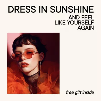
Dress in Sunshine and Feel Like Yourself Again
When getting dressed starts to feel like guesswork—too bright, too dull, too “not you”—it’s often not your style that’s the problem. It’s the colors. Our Dress in Sunshine and Feel Like Yourself Again – Summer Color Palette Clothing eBook is designed to help Summer-season wearers choose shades that look naturally harmonious, build outfits faster, and create a warm-weather wardrobe that feels light, flattering, and confidently you. For more guidance, see Color Me Color Analysis.
Summer palettes are about softness, coolness, and that “watercolor” blend that looks effortless in natural daylight. Once you start filtering your closet through the right tones, the pieces you already own often make a lot more sense—and shopping gets noticeably easier. For further reading, see Color in Fashion.
Who this Summer color palette guide is for
- If you suspect you fit the Summer family (cool-leaning, softer, more muted coloring) and want practical direction without starting over.
- If you own plenty of clothes but outfits still look “off” in daylight or in photos.
- If you prefer a smaller, more wearable wardrobe with fewer impulse buys and more repeatable outfits.
- If your mornings are busy and you want a color-first approach that makes mixing and matching simpler.
- If you want a giftable, feel-good guide for a friend, sister, or partner who loves personal color analysis and wants a clear getting-dressed plan.
What “Summer” colors do for your face (and why it matters)
Summer palettes are typically cool to neutral-cool, soft, and blended—more “sea glass” than “highlighter.” When your clothing color temperature and intensity match your natural coloring, your face stays the focal point.
- The right Summer shades support a rested, even look; features read clearer and balanced.
- Too warm can pull sallow, too bright can emphasize unevenness, and too dark can feel heavy in strong summer light.
- Harmony isn’t about hiding; it’s about letting your coloring lead so outfits feel like an extension of you.
If you want a quick refresher on how color is perceived, Britannica’s overview of color and perception is a helpful reference. For industry context on color direction and naming, the Pantone Color Institute is a widely recognized resource.
Inside the eBook: personal color analysis that turns into outfits
Color analysis can feel inspiring—until you’re standing in your closet thinking, “Okay, but what do I wear on Tuesday?” Our team built this guide to bridge that exact gap.
- A clear, wearable Summer palette direction so shopping and styling stop feeling random.
- Guidance for translating “personal color analysis” into real clothing choices—tops, dresses, denim, knits, and light layers.
- Wardrobe-building support to stay consistent across workdays, weekends, and events.
- Confidence-focused styling: fewer “maybe” pieces, more outfits that feel immediately right in the mirror.
- Designed to use while closet-editing or shopping—quick reference rather than theory-heavy reading.
If you like pairing practical wardrobe tools with content planning (for example, outfit videos or capsule reveals), you may also want our Hashtags to Go Viral on TikTok: The Ultimate Checklist for Boosting Your Reach—a simple add-on for creators who want a smoother posting workflow.
Build a flattering Summer wardrobe with confidence: the color-first method
When you lead with color, you reduce decision fatigue. Instead of trying to force every trend to work, you build a small system that repeats—top to bottom—without feeling boring.
Step-by-step, the Summer way
- Step 1: Choose 2–3 core neutrals that suit Summer softness (avoid harsh contrast if it fights your coloring).
- Step 2: Add a small set of signature Summer shades for tops and dresses—colors closest to the face do the most work.
- Step 3: Create repeatable outfit formulas: top + bottom + light layer, dress + cardigan, tank + overshirt, and similar “grab-and-go” structures.
- Step 4: Keep prints and accents aligned: softer contrast, blended patterns, and cool-leaning metals typically feel more natural for Summer palettes.
- Step 5: Shop with a “palette filter”: if the color doesn’t support your face in natural light, it doesn’t come home.
A simple Summer wardrobe blueprint (color-led)
| Category | What to aim for | Why it works for Summer palettes |
|---|---|---|
| Everyday tops | Soft cool shades in your palette; avoid overly saturated brights | Keeps the face looking fresh and balanced |
| Dresses | Muted, cool-leaning solids or blended prints | Reads effortless in sunshine without feeling loud |
| Bottoms | Medium-light neutrals; gentle contrast with tops | Prevents outfits from looking heavy in warm weather |
| Layers | Lightweight cardigans/overshirts in soft neutrals | Adds polish without overpowering your coloring |
| Accessories | Cool-toned accents; softer leathers; gentle contrast | Finishes the outfit while keeping harmony |
Closet reset for Summer: what to keep, tailor, and let go
Outfit ideas that feel like sunshine (without looking overdone)
Make shopping easier: a quick color check to use in-store
FAQ
How do I know if I’m a Summer palette?
Summer palettes usually show up as cool or neutral-cool undertones with softer contrast overall—features blend rather than “pop” in stark contrast. If that sounds familiar, our eBook helps you turn that Summer direction into wearable clothing choices you can repeat.
Can I still wear black or very bright colors if I’m a Summer?
Yes—try moving intense shades away from your face, choosing softer versions, or adding a Summer-friendly layer near your neckline to rebalance. Accessories can also control contrast so the color feels intentional instead of overpowering.
What’s the fastest way to build a flattering summer wardrobe from this guide?
Start with 2–3 Summer-friendly neutrals and 5–7 signature shades, then build 10–15 mix-and-match outfits using simple formulas you can repeat. The goal is quick confidence: fewer “maybe” pieces and more outfits that feel right immediately.












Leave a comment